Ever felt like charts were a secret language designed solely to make you question your life choices? You’re not alone. In this breakdown, you’ll find straightforward ideas to help you spot trends faster than your friend finds a lucky penny on game day-without pretending the lines can predict the future.
There’s something undeniably satisfying about seeing your hunches mapped out on a crisp chart. Whether the line swoops up like a caffeine rush or dips like a rollercoaster, the story is always there-hidden in plain sight. Charts don’t tell you what will happen next, but they do make it easier to understand what has already unfolded.
The real value is piecing together what happened, when and how different moments influenced the line. It’s not fortune telling-just sensible interpretation with a dash of suspense, and a clear reminder that past movements never guarantee the next one.

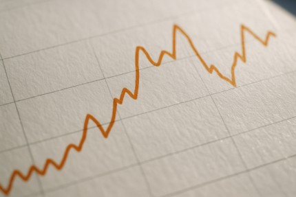
Trained eyes can spot momentum changes quicker than you can say "I should’ve brought a calculator." Look for sudden jumps, odd plateaus or that zigzag section that resembles your heartbeat during a close call. Then ask yourself what might explain it, rather than assuming it must continue in the same direction.
Some charts love drama. Outliers-those single blips far from the pack-might mean big news or, occasionally, someone just tripped over a decimal point. Context is everything: check longer time frames and extra information before treating any spike as a game changer.
While a chart can be a useful sidekick, it’s no substitute for clear thinking. Data can’t predict the unexpected, like sudden rain delays or a seagull interrupting the game. And no chart, model or system can remove risk or guarantee a profit-especially where real money is involved.
We’ve all been there: lines everywhere, colors galore and your brain quietly asks, "So... what now?" Take a breath. Zoom out. Sometimes the answer is simpler than it first appears.
If in doubt, look for the overall trend before getting lost in the weeds. Big-picture thinking saves time-and headaches-and helps you avoid snap decisions based on one noisy blip.
It’s easy to overanalyze a chart and convince yourself the next big move is just around the corner. Spoiler: it’s usually not that simple. Don’t let wishful thinking override clear evidence, and remember that even the cleanest line can’t promise what happens on the next point.
Charts are best used as part of a wider game plan. They don’t make choices, and they don’t guarantee outcomes, but they’ll help you feel more informed about the decisions you do make. Think of them as a road map: handy for orientation, but you still choose if, when and how far to travel.

Great visuals often line up with something happening off the page. Injuries, weather changes or a sudden mood shift from the crowd-these can turn a flat chart into a wild ride in seconds. Even with extra context, there will always be surprises.
Charts are like a well-organized closet-everything in its place, if you know what you’re looking at. Recognize recurring patterns and you’ll feel more prepared, while still accepting that no pattern guarantees what comes next.
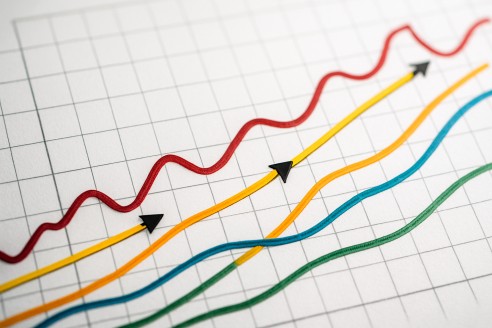
Bright colors aren’t just for holiday sweaters. Charts use them to highlight differences, spotlight the unusual or simply keep your attention focused on the main story arc.
There’s a time for bold moves and a time to wait. If your chart looks like it’s been through a blender, maybe give it a minute to settle. Clean trends are easier to work with than spaghetti graphs, and sometimes the best decision is simply to pause.
Patience and perspective go a long way-especially when real money or important choices are on the line. No rush, no pressure, just steady, informed steps.
If you treat every chart like a puzzle to be explored, you’ll eventually notice the picture comes into focus. Whether you’re a numbers nerd or a casual observer, there’s always something new to learn from those points and lines, without expecting guaranteed “wins” from any pattern.
When you line up your data, focus on one variable and see how it interacts with the chart, things start to click. Zoom in on the section where momentum appears to shift, then zoom back out to see the bigger story. Often, that’s where useful insights and memorable stories are born-not promises, but perspective.